Redesigning an internal healthcare dashboard to improve clinical efficiency and decision-making
Role: UX / AI Generalist · Domain: Healthcare (Internal EHR Systems)· Platform: Desktop
Falcon Dashboard
Context
Falcon is a large, internally developed EHR (Electronic Health Records) application used by clinical and administrative staff at Carrollton Regional Medical Center.
The dashboard serves as the primary entry point for daily workflows, including patient management, task tracking, and operational visibility.
My Role
Led UX analysis and redesign of the Falcon dashboard
Conducted workflow reviews with clinicians and administrative staff
Identified high-frequency tasks and information needs
Designed low- and high-fidelity dashboard concepts
Applied accessibility and usability best practices
Collaborated closely with Informatica developers to ensure feasibility
Research and key Insights
My research focused on real-world usage, not assumptions.
Methods
Interviews with clinical and administrative users
Workflow walkthroughs and task observation
Review of support issues and recurring user complaints
Analysis of existing dashboard usage patterns
Key Insights
Users scanned the dashboard first, then acted—visual hierarchy mattered more than completeness
Important alerts competed visually with low-priority information
Users relied on memory instead of the interface to find frequent actions
Design Strategy
Establish clear visual hierarchy for fast scanning
Surface high-priority information without overwhelming users
Reduce interaction cost for frequent actions
Maintain consistency with Falcon’s broader design system
Support accessibility and readability across environments
Design Execution
The Problem
Clinical users needed to:
Quickly understand system status and priorities
Navigate to high-frequency tasks without friction
Avoid cognitive overload during busy shifts
The existing dashboard:
Displayed too much information at once
Lacked clear hierarchy and visual prioritization
Required unnecessary navigation to complete common tasks
In a clinical environment, some times minutes matter—and the dashboard was not supporting that reality.
Reorganized dashboard content into priority-based sections
Introduced consistent spacing and alignment to reduce visual noise
Emphasized critical information using contrast and grouping—not color overload
Simplified navigation paths to high-frequency workflows
Designed layouts to scale across different screen sizes
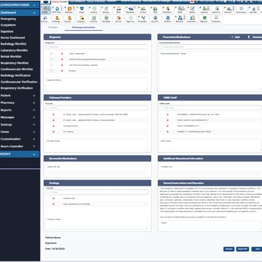
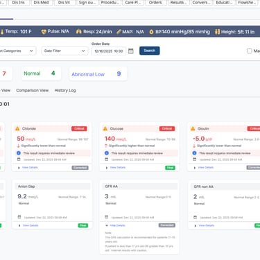
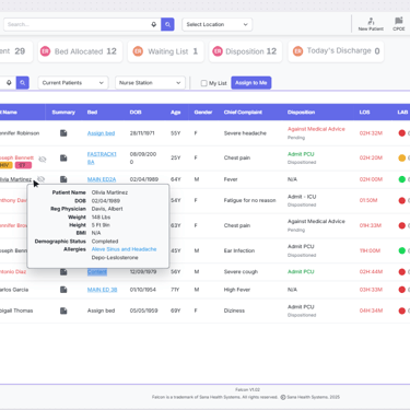
Falcon Wireframes
Click to open a larger image
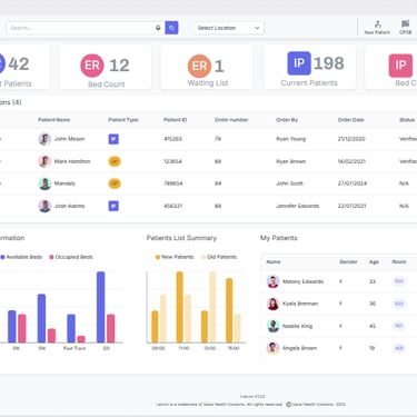
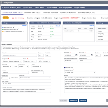
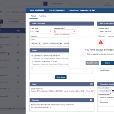
Dashboard reorganized to surface critical tasks first. Improved spacing and grouping reduces cognitive load. Consistent component usage aligns with Falcon design system
Outcome
Improved scanability and clarity of the dashboard
Reduced effort to access high-frequency tasks
Better alignment between user expectations and system behavior
Established dashboard patterns reusable across Falcon modules
Reflection
Internal healthcare systems succeed when they respect users’ time and cognitive load.
Designing the Falcon dashboard reinforced that removing friction is often more impactful than adding features.
Designing healthcare experiences requires balancing empathy, clarity, and regulatory constraints. Small usability improvements can significantly impact patient trust and adoption.