Before & After
Improving Clinical Decision-Making in Lab Results View
Clinicians needed to review lab results quickly and accurately under time pressure. The legacy interface presented all results with similar visual weight, increasing cognitive load and slowing prioritization.
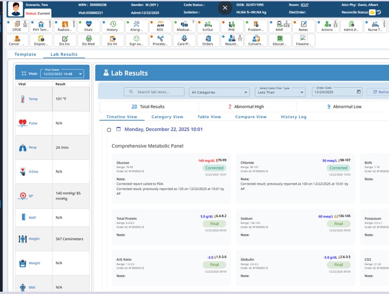
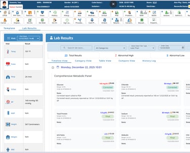
Before
High visual density with limited hierarchy made scanning difficult
Critical, abnormal, and normal results competed visually
Status indicators were present but not immediately actionable
Clinicians had to read values carefully to identify urgency
Important context (vitals, counts, trends) was visually separated
Patient vitals panel took valuable real estate
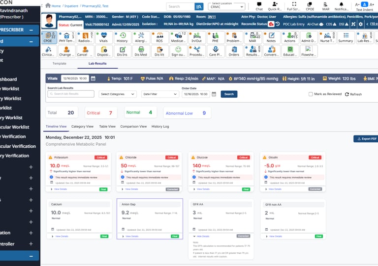
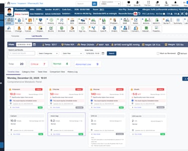
After
Introduced clear prioritization of Critical, Abnormal, and Normal results
Used status-based grouping to surface urgent labs immediately
Improved visual hierarchy using spacing, contrast, and card structure
Added concise status messaging (“requires immediate review”)
Reduced cognitive load by making urgency visible at a glance
Aligned supporting data (vitals, counts, timestamps) closer to decision context
How the redesign reduced friction:
Clinicians can identify critical labs without reading every value
Visual scanning replaces mental calculation and comparison
Urgent results rise to attention automatically
Fewer clicks and less navigation to assess patient status
Reduced risk of missing critical information during busy shifts
UX shift: From reading to understand → to seeing to act.
Why this matters:
Clinical environments are time-sensitive and interruption-heavy
Faster recognition of abnormal results supports safer decisions
Reduced cognitive load improves focus during high-pressure workflows
Clear prioritization helps clinicians act with confidence
Clear status indicators reduce reliance on color alone
Improved spacing and hierarchy support readability
Consistent card patterns improve learnability across modules
Accessibility considerations