Before & After
Improving Trust and Clarity in a Public-Facing Government Program (HHSC CPP)
The Community Partner Program (CPP) is a public-facing HHSC initiative designed to help community organizations assist Texans in applying for and managing benefits.
The legacy site contained important information but lacked clear hierarchy, engagement cues, and trust-building elements—making it difficult for users to quickly understand the program’s value or take action.
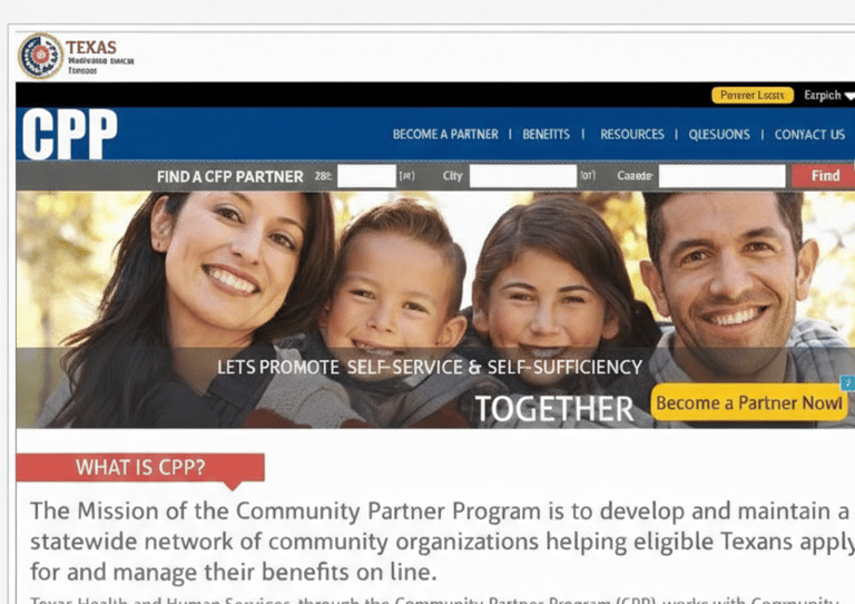
Before
Dense, text-heavy layout with weak visual hierarchy
Limited guidance on what users should do next
Core value proposition buried within long paragraphs
Low engagement for first-time visitors
Trust signals and program legitimacy not immediately visible

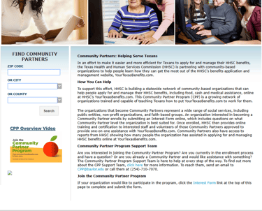
After
Introduced engaging, human-centered visuals to establish relevance
Clearly articulated the program’s mission and value proposition
Added a persistent call to action across pages
Structured content using strong headings and scannable sections
Surfaced credibility through facts, program scope, and regional coverage
Improved navigation and content flow for first-time visitors

How the redesign reduced friction:
Users can understand the program’s purpose within seconds
Clear calls to action guide users without forcing decisions
Visual hierarchy replaces long-form reading with scanning
Trust signals reduce hesitation for community organizations
Information feels approachable rather than bureaucratic
UX shift:
From reading to figure it out → to understanding and acting with confidence.
Why this matter for public services:
Public programs rely on trust and clarity to drive adoption
Confusing interfaces discourage participation and outreach
Clear communication supports equity and access
Better UX enables community partners to serve more people
Scannable structure supports cognitive accessibility
Clear headings and hierarchy improve screen-reader navigation
Visual storytelling complements text without replacing it
Accessibility Considerations