Before & After
Improving Accuracy in Patient Merge Workflow
Patient merge is a high-risk administrative workflow where incorrect decisions can lead to duplicated records, lost clinical history, or patient safety issues.
Users must compare two patient records quickly, accurately, and with confidence.
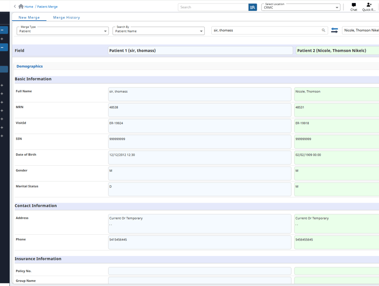
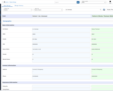
Before
Dense, form-like layout required users to manually scan every field
Matching and non-matching values were visually similar
Important discrepancies (MRN, DOB, SSN) were easy to miss
No clear prioritization of high-risk fields
Cognitive load increased with record length and scrolling
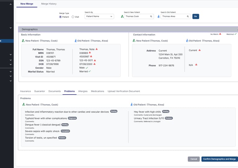
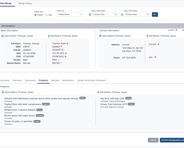
After
Grouped information into clear, semantic sections (Demographics, Contact, Problems, etc.)
Introduced explicit match / no-match indicators at the field level
Used visual cues to surface discrepancies immediately
Reduced visual noise by simplifying layout and spacing
Clearly labeled “New Patient” vs “Old Patient” context
Consolidated decision action into a single, clear confirmation step
How the redesign reduced friction:
Users can identify mismatches at a glance instead of reading every field
High-risk discrepancies surface visually without interpretation
Grouped sections reduce scrolling and mental context switching
Visual confirmation reduces hesitation and second-guessing
Clear merge action reinforces confidence in the final decision
UX shift:
From carefully reading to avoid mistakes → to seeing discrepancies and acting with confidence.
Why this matters:
Patient merge errors can affect clinical safety and data integrity
Administrative users work under time pressure with high accountability
Reducing cognitive load lowers the likelihood of costly mistakes
Clear visual guidance supports consistent decision-making across users
Improved confidence reduces rework and audit risk
Match indicators reduce reliance on memory and visual scanning alone
Structured grouping improves readability and focus
Consistent patterns support learnability for infrequent users
Accessibility considerations